Velveté came to us wanting a brand identity that could embody the essence of modern luxury, creating a visual system sophisticated enough to honor tradition and distinctive enough to stand apart.

Brand Identity, Packaging Design
VELVETÉ
A luxury fashion house exploring the intersection of timeless European craftsmanship and modern refinement. Built to scale across retail, packaging, and digital.
Services
Brand Identity, Packaging Design, Art Direction
Context
Velveté approached us to transform a luxury fashion concept into a fully realized brand world. The brief was to define a visual language that balanced heritage, sophistication, and modern elegance while creating a foundation for long-term brand growth.
Strategy
Velveté needed to establish itself as a luxury fashion house without relying on the visual conventions that immediately signal "luxury." The strategy was to create a sense of permanence through a small number of deliberate brand codes rather than layering on decorative details. The V and E monogram became the primary identifier, giving Velveté a recognisable symbol that could exist independently from the wordmark. The colour palette was intentionally narrowed to ivory, taupe, black, and warm gold, creating consistency across the identity while allowing the brand's photography and materials to carry more of the visual expression. Maison de Couture nodded to fashion-house tradition without tipping the identity into pastiche. From there, Timeless. Refined. Elevated. became the three principles behind the system. They shaped the decisions around typography, composition, packaging, imagery, and tone, ensuring that every touchpoint contributed to the same perception. The result is a new fashion house carrying the visual confidence of an established one.
Creative Direction
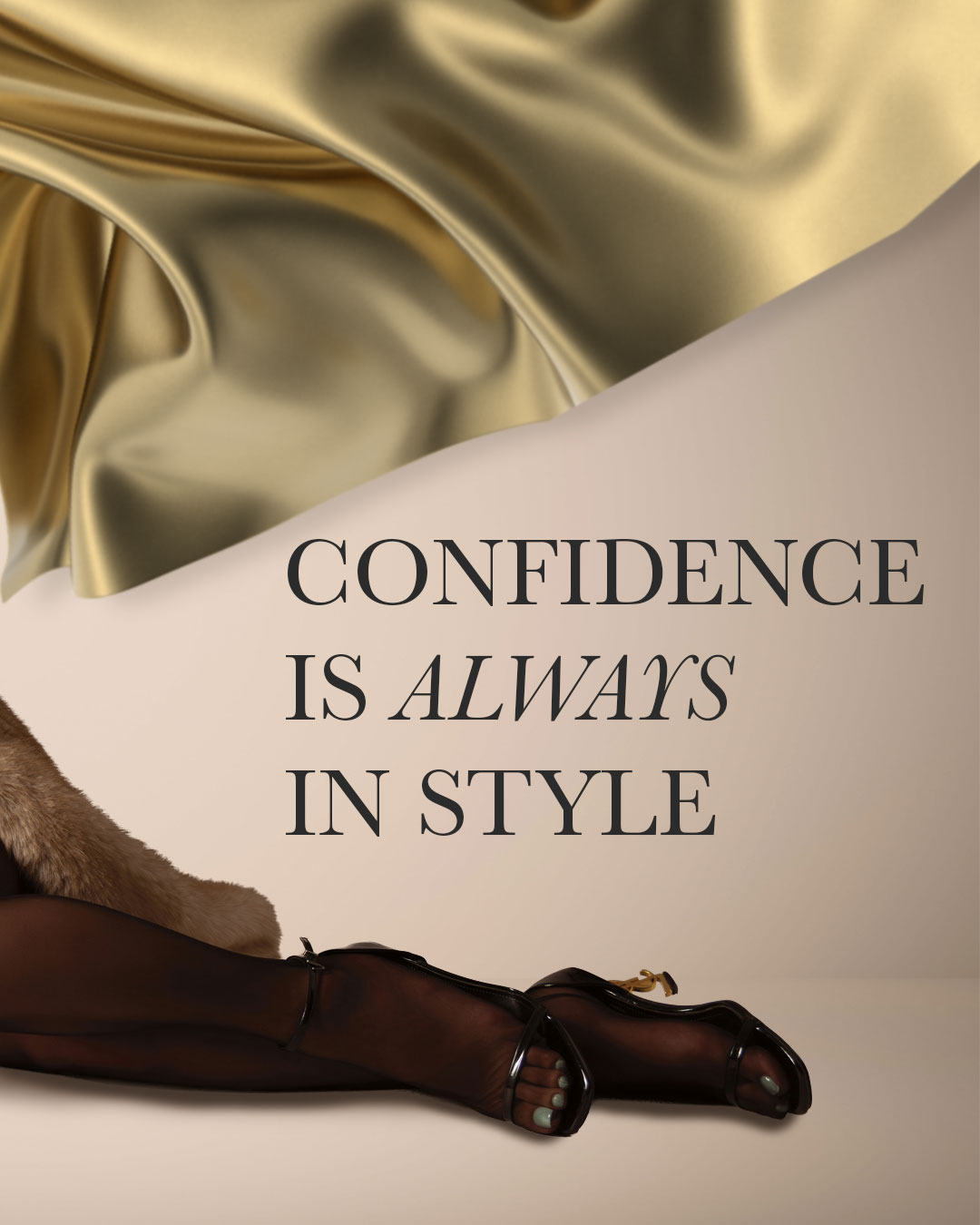
The visual system was built around a single monogram, an interlocking V and E, designed to function independently of the wordmark, so it could carry the brand on a tag or storefront window without ever needing to spell out the name. The wordmark itself pairs a high-contrast display serif for headers with Baskerville URW for supporting text, giving the identity a formal, editorial voice rather than a trend-driven one. Lockups were built to flex across formats: horizontal for packaging, stacked for retail signage, and a circular badge for stamps and seals, all unified by the same restrained palette of ivory, taupe, black, and warm gold. The campaign work extended that language into a full editorial world. Rather than product-forward advertising, the imagery leans into mood and gesture: gold silk caught mid-motion, low amber lighting, a woman glimpsed from behind a veil. Copy is used sparingly and set large: Own the Room, Confidence Is Always in Style, The Art Is in the Details, functioning less like taglines and more like captions to a mood, reinforcing the sense that the brand speaks in atmosphere rather than announcement. Even the seasonal “magazine cover” treatment, Fall/Winter 2026, The Art of Being Unforgettable, turns the campaign into an editorial experience rather than a straightforward product showcase. This was a deliberate choice to make the brand feel discovered rather than sold.
Duration
6 weeks