Morven Atelier came to us with a vision for a dark, editorial fashion house; a brand world that could carry the artistry and exclusivity behind each collection without relying on convention.

Branding
MORVEN ATELIER
A dark, editorial atelier built around the idea that true beauty lives in shadow. Moody, precise, and unapologetically bold.
Services
Brand Identity, Packaging Design, Art Direction
Context
Morven Atelier is a luxury fashion house that needed a cohesive identity across collections, campaigns, and digital experiences. We created an editorial-inspired brand system with a refined wordmark, elevated typography, and a visual language built on shadow and restraint. Timeless rather than trend-driven.
Strategy
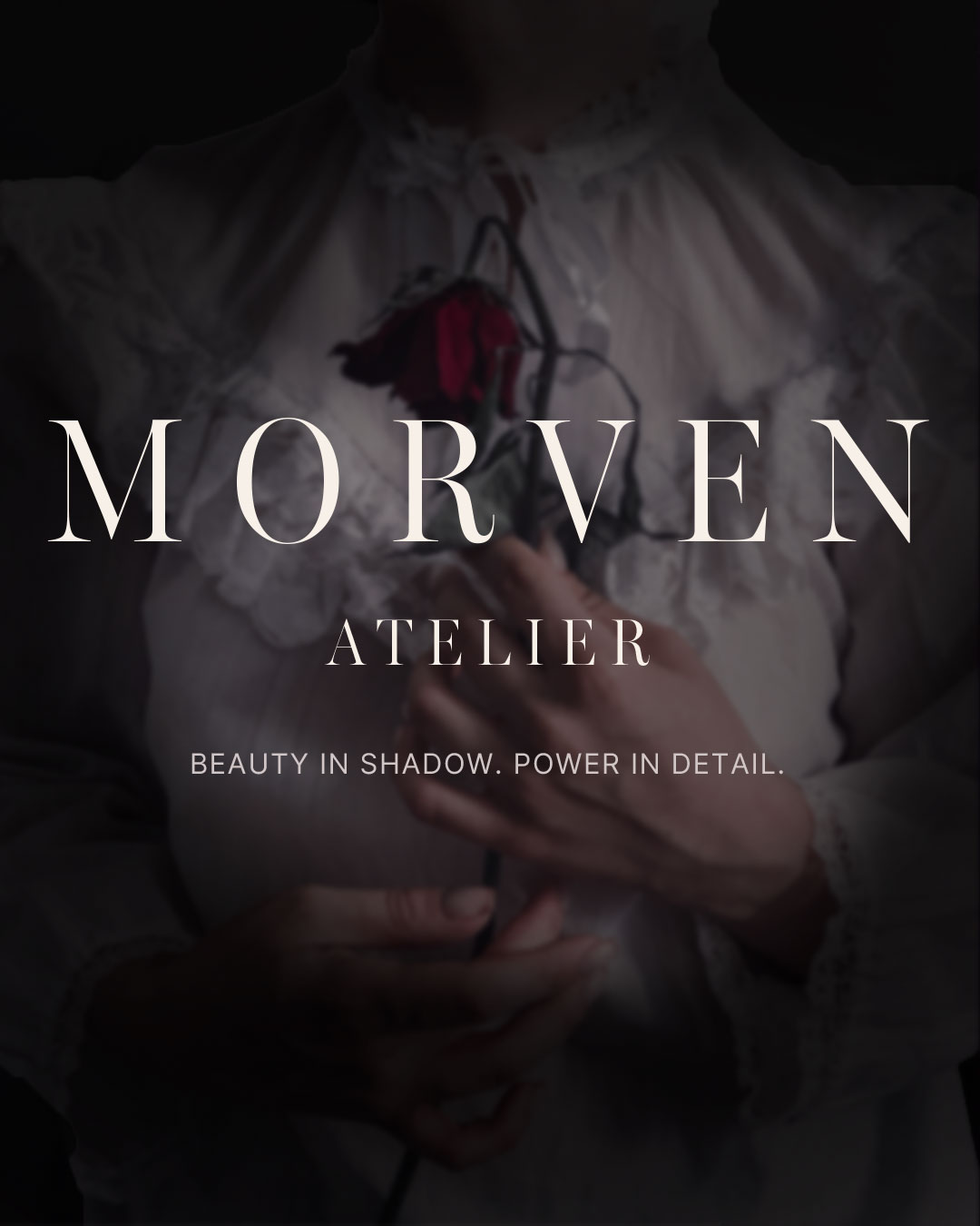
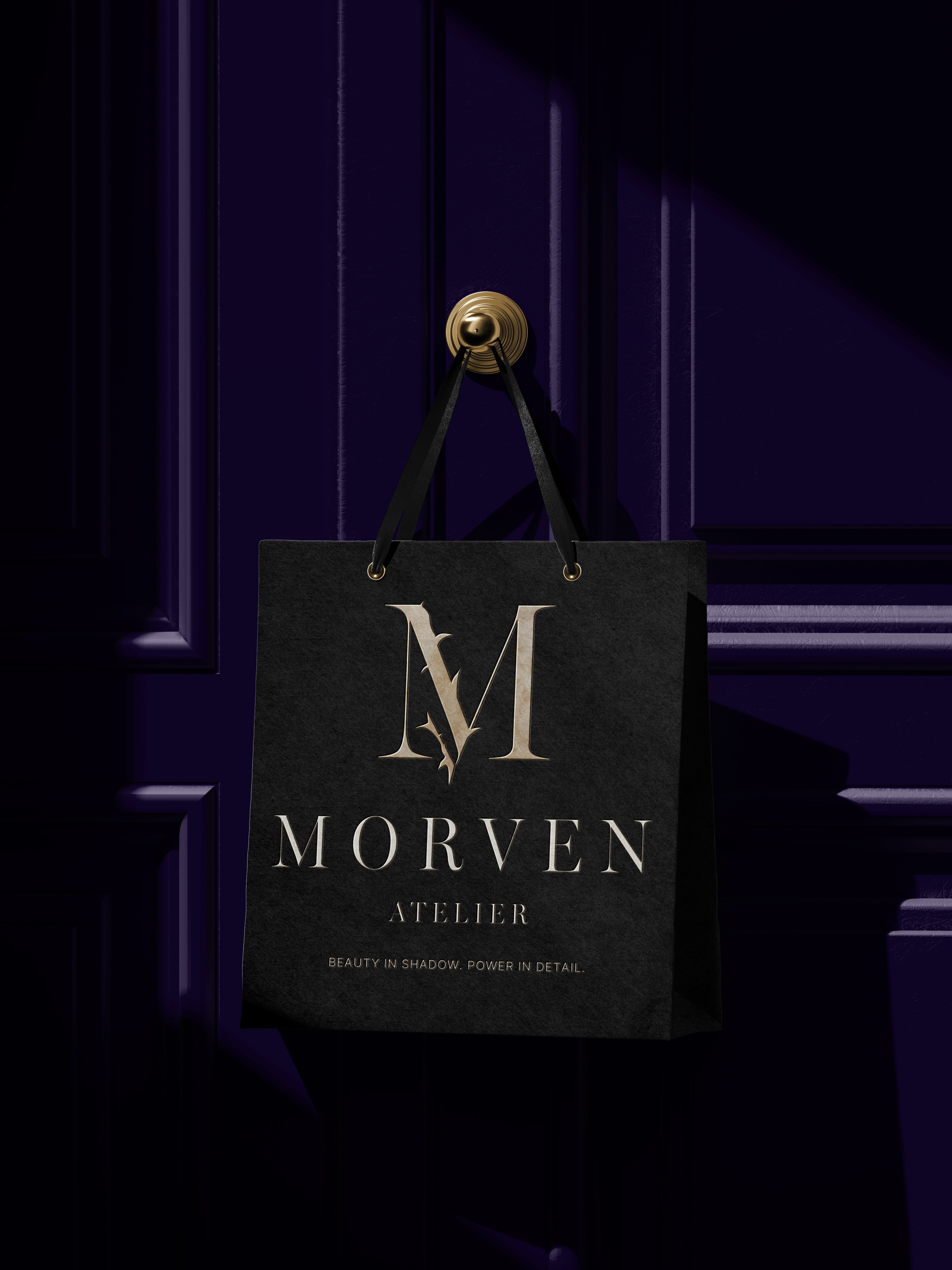
Morven Atelier needed to hold two things in tension: dark, editorial mystery and genuine luxury polish, without allowing the darker aesthetic to overwhelm the refinement of the brand. The strategy leaned into shadow as a positioning device rather than simply an aesthetic choice. Instead of showing everything, the identity reveals selectively, letting restraint and contrast do the work of signaling exclusivity. The thorn detail worked into the M monogram carries that tension directly into the mark itself: refined typography with a single sharp, almost dangerous edge. The tagline, Beauty in Shadow, Power in Detail, became the operating principle. The campaign needed to translate the identity's central tension, control versus polish, into a narrative someone could actually walk through, not just a set of pretty images. The dead rose on the opening slide and the alive rose on the closing slide became the spine of that narrative: an object transformed, reinforcing the idea at the heart of the brand: that beauty, like the collection, blooms in the dark. Between those two bookends, the sequence alternates between quiet, tactile detail shots and moments of motion and presence, mirroring the brand's own rhythm of restraint punctuated by intensity. OOH extended that same asset into physical space through a transit tunnel placement and a freestanding lightbox.
Creative Direction
The identity centers on a serif M monogram with a thorn motif integrated into its form, paired with the full wordmark set in a tall, tracked-out serif for “Morven” and a smaller sans-serif “Atelier” beneath it. The pairing reads as editorial rather than purely decorative. Miller Banner Condensed handles headers and titles, while Inter carries body copy, creating a sharp contrast between dramatic display moments and clean, legible supporting text. The palette stays almost entirely dark, with deep plum, near-black, and pale lavender-gray, while cream is used sparingly to give key surfaces room to breathe. That restraint carries through the applications: a garment tag rendered nearly invisible against black fabric, and a tote bag using foil-level contrast rather than color to stand out. The campaign extends the same language into motion and narrative — lace, buttons, and hand-worked detail shots alternate with moments of movement, closing on the brand's rose motif as it shifts from dead to blooming. Across every touchpoint, from packaging to campaign imagery, the brand asserts itself through precision and shadow rather than volume.
Duration
8 weeks