Halo Skin needed packaging and branding that could compete in a crowded skincare market without falling into predictable clinical aesthetics or overdone luxury tropes.


Brand Identity, Product Design, Packaging Design
HALO SKIN
A luxury skincare concept centered around radiance, restraint, and intentional self-care. Developed from strategy through packaging and 3D visualization.
Services
Packaging Design, Brand Identity, 3D Product Rendering
Context
Halo Skin is a skincare brand built around the balance of efficacy and elegance. The challenge was designing a visual identity and packaging experience refined enough to feel premium, while still communicating trust, care, and transformation.
Strategy
Halo Skin needed to occupy a space between clinical skincare and conventional luxury, communicating efficacy and quality without relying on the sterile visual language of ingredient callouts or the ornate codes of traditional beauty. The strategy was to make radiance feel tangible, modern, and desirable, using restraint and softness as signals of quality. A controlled palette, tactile imagery, and quiet symbolism create a world that feels elevated without becoming precious, while the halo-and-droplet mark connects the brand name to its core promise of luminous, hydrated skin. That foundation carried into the campaign, where radiance, softness, and intimacy became the visual focus. Rather than presenting perfect skin from a distance, the imagery brings the viewer closer through reflective surfaces, fluid textures, close-up perspectives, and subtle transformations, making the product experience feel immediate and tangible.
Creative Direction
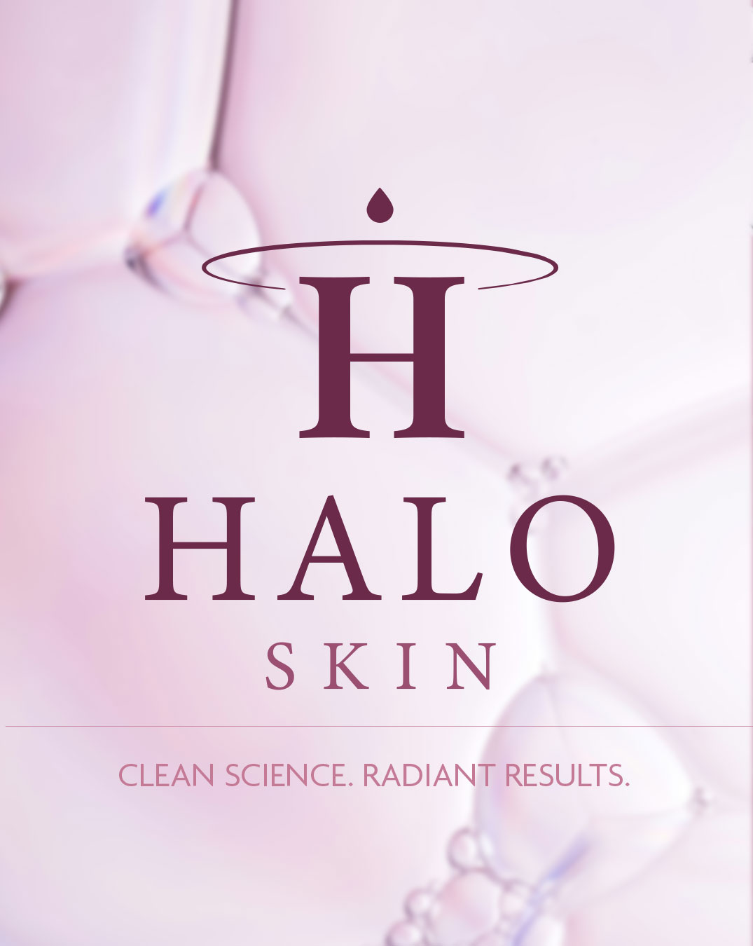
The identity is built around a monogram H topped with a halo-and-droplet motif, paired with a refined serif wordmark. Argent CF headlines and Agenda body copy give the identity a considered, editorial quality without falling into clinical skincare conventions. The palette moves through blush, mauve, deep plum, and cream — soft enough to feel gentle and skin-focused, while the deeper plum adds contrast and prevents the brand from feeling like generic pastel beauty. That visual language extends into the campaign through softness, radiance, and intimacy. Close-up skin photography, reflective surfaces, fluid textures, and controlled lighting create imagery that feels sensorial without becoming overly polished. The result is a beauty world that feels elevated and contemporary, while keeping the focus on the skin itself. Packaging carries the same system across the Aura Drops dropper bottle and hand cream carton, with the wordmark and halo mark scaled to work across both intimate label applications and larger formats. The Aura Drops bottle was modelled and rendered in Blender, allowing full control over its lighting, reflections, and materiality to create a tactile product visual before a physical unit existed.
Duration
6 weeks